Loading... # CSS(五) ## flex(弹性布局) 采用此布局的元素称为Flex容器,其所有子元素自动成为容器成员(项目) 默认存在水平主轴(main axis)和垂直交叉轴(cross axis) 主轴开始位置(域边框的交叉点)叫做main start,结束位置叫做main end 交叉轴开始位置叫做cross start,结束位置叫做cross end 项目默认沿主轴排列,单个项目占据的主轴空间叫做main size,占据的交叉周空间叫做cross size ### 属性 display: flex; #### 容器属性(container)父元素 - flex-direction:main axis的方向 * row:默认值,主轴为水平方向,起点在左端 * row-reverse:主轴在水平方向,起点在右端 * column:主轴为垂直方向,起点在上端 * column-reverse:主轴为垂直方向,起点在下端 - justify-content:确定容器内元素的对齐方式 * flex-start:默认值,与main start对齐 * flex-end:与main end对齐 * center:居中 * space-between:flex items 之间的距离相等,与main start、main end两端对齐 * space-evenly:flex items 之间的距离相等,flex items与main start、main end之间的距离等于flex itens之间的距离 * space-around:flex items 之间的距离相等,flex items与main start、main end之间的距离等于flex itens之间的距离的一半 - align-items:确定容器内元素在交叉轴的对齐方式 * flex-start:与cross start对齐 * flex-end:与cross end对齐 * stretch:前提是items不设置高度,此时会自动拉伸填充整个容器高度 * center:居中 * baseline:与基准线对齐 - flex-wrap:决定flex container是单行还是多行 * nowrap:默认,单行 * wrap:多行 * wrap-reverse:同前 - align-content:容器内元素存在多行,确定元素如何对齐 和justify-content相似,这个是横轴那个是竖轴 - flex-flow:flex direction和flex wrap的组合 #### 项目属性(item)子元素 - order:定义项目的排列顺序。数值越小,排列越靠前,默认为0 - flex-basis:设置items的宽度,作用大于width - flex-grow:决定flex items如何扩展 sum等于所有flex-grow之和 单个item扩展size=剩余size\*flex-grow/sum - flex-shrink:决定flex items如何收缩 等比例缩小 - align-self:同align-items,可继承(auto)和覆盖后者 - flex:flex-grow、flex-shrink、flex-basis的组合(注意顺序) 上课没有应用学习,自己敲个骰子案例 普通布局 ~~~html <!DOCTYPE html> <html lang="en"> <head> <meta charset="UTF-8"> <meta http-equiv="X-UA-Compatible" content="IE=edge"> <meta name="viewport" content="width=device-width, initial-scale=1.0"> <title>骰子</title> <style> .square{ display: flex; border-radius: 10%; float: left; height: 300px; width: 300px; background-color: yellow; margin: 10px; } .num{ height: 80px; width: 80px; border-radius: 50%; background-color: blue; margin: 10px; } .square:nth-child(1){ justify-content: center; align-items: center; } .square:nth-child(2){ justify-content: space-between; } .square:nth-child(2) .num:nth-child(2){ align-self: flex-end; } .square:nth-child(3){ justify-content: space-between; } .square:nth-child(3) .num:nth-child(2){ align-self: center; } .square:nth-child(3) .num:nth-child(3){ align-self: flex-end; } .square:nth-child(4){ justify-content: space-between; flex-wrap: wrap; } .square:nth-child(4) .num:nth-child(1){ margin-right: 110px; margin-bottom: 110px; } .square:nth-child(5){ justify-content: space-between; flex-wrap: wrap; } .square:nth-child(5) .num:nth-child(1){ margin-right: 110px; } .square:nth-child(5) .num:nth-child(3){ margin-left: 110px; margin-right: 110px; } .square:nth-child(6){ justify-content: space-between; flex-wrap: wrap; } .square:nth-child(6) .num:nth-child(1){ margin-right: 110px; } .square:nth-child(6) .num:nth-child(3){ margin-right: 110px; } .square:nth-child(6) .num:nth-child(5){ margin-right: 110px; } </style> </head> <body> <div class="dice"> <div class="square"> <div class="num"></div> </div> <div class="square"> <div class="num"></div> <div class="num"></div> </div> <div class="square"> <div class="num"></div> <div class="num"></div> <div class="num"></div> </div> <div class="square"> <div class="num"></div> <div class="num"></div> <div class="num"></div> <div class="num"></div> </div> <div class="square"> <div class="num"></div> <div class="num"></div> <div class="num"></div> <div class="num"></div> <div class="num"></div> </div> <div class="square"> <div class="num"></div> <div class="num"></div> <div class="num"></div> <div class="num"></div> <div class="num"></div> <div class="num"></div> </div> </div> </body> </html> ~~~ 实现效果 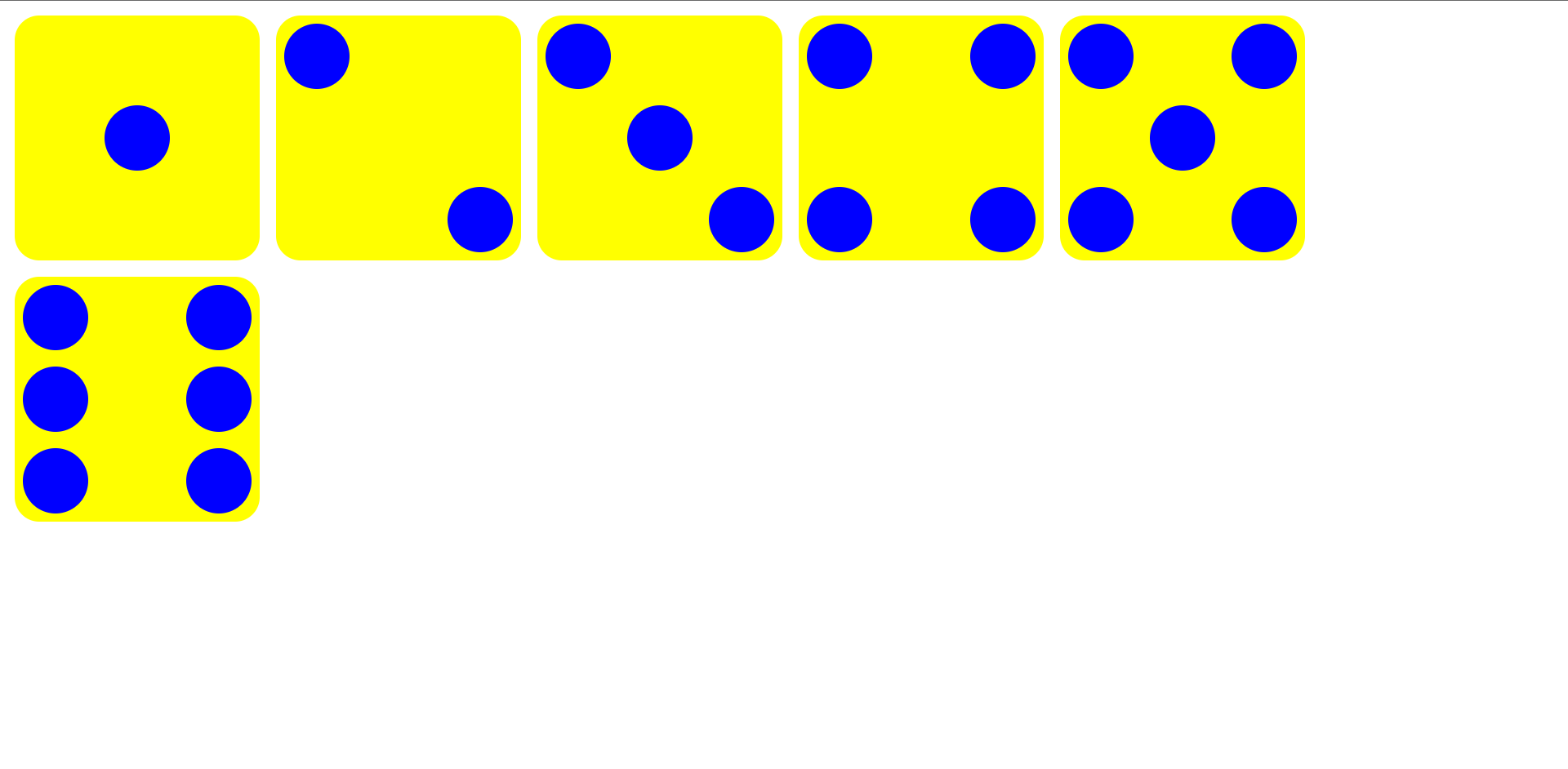 看到有人实现骰子3D旋转,就尝试了下,动画控制掌握的不太好 只改了css ~~~CSS body{ perspective: 8000px; background-color: black; } .dice{ position: relative; top: 300px; left: 300px; width: 300px; height: 300px; transform-style: preserve-3d; transform: rotateX(180deg); animation: run 3s linear 0s infinite; } @keyframes run { 0%{ transform: rotateX(0deg) rotateY(0deg) rotateZ(0deg); } 100%{ transform: rotateX(50deg) rotateY(180deg) rotateZ(180deg); } } .square{ position: absolute; display: flex; border-radius: 10%; box-shadow: 0px 0px 10px 10px red inset; height: 300px; width: 300px; background-color: yellow; margin: 10px; } .square:nth-child(1){ justify-content: center; align-items: center; transform: rotateX(-90deg) translatez(-150px); } .square:nth-child(2){ justify-content: space-between; transform: rotateY(-90deg) translatez(150px); } .square:nth-child(2) .num:nth-child(2){ align-self: flex-end; } .square:nth-child(3){ justify-content: space-between; transform: rotateZ(-90deg) translatez(150px); } .square:nth-child(3) .num:nth-child(2){ align-self: center; } .square:nth-child(3) .num:nth-child(3){ align-self: flex-end; } .square:nth-child(4){ justify-content: space-between; flex-wrap: wrap; transform: rotateZ(-90deg) translatez(-150px); } .square:nth-child(4) .num:nth-child(1){ margin-right: 110px; margin-bottom: 110px; } .square:nth-child(5){ justify-content: space-between; flex-wrap: wrap; transform: rotateY(-90deg) translatez(-150px); } .square:nth-child(5) .num:nth-child(1){ margin-right: 110px; } .square:nth-child(5) .num:nth-child(3){ margin-left: 110px; margin-right: 110px; } .square:nth-child(6){ justify-content: space-between; flex-wrap: wrap; transform: rotateX(-90deg) translatez(150px); } .square:nth-child(6) .num:nth-child(1){ margin-right: 110px; } .square:nth-child(6) .num:nth-child(3){ margin-right: 110px; } .square:nth-child(6) .num:nth-child(5){ margin-right: 110px; } .num{ height: 80px; width: 80px; border-radius: 50%; background-color: blue; margin: 10px; } ~~~ 效果如图 <img src="http://120.78.215.15/usr/uploads/2021/10/538633466.png" style="zoom:50%"> [dplayer url="http://120.78.215.15/video/dice.mp4" pic="" /] 案例二 文章页面布局实现 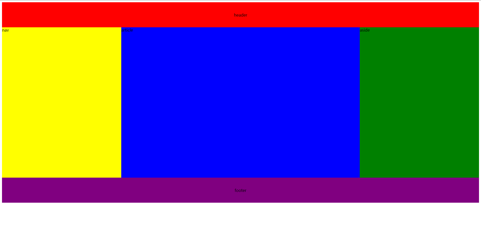 ~~~html <!DOCTYPE html> <html lang="en"> <head> <meta charset="UTF-8"> <meta http-equiv="X-UA-Compatible" content="IE=edge"> <meta name="viewport" content="width=device-width, initial-scale=1.0"> <title>Flex布局</title> <style> .wrapper{ display: flex; flex-direction: column; } header, footer{ width: 100%; height: 100px; display: flex; justify-content: center; align-items: center; } header{ background-color: red; } .container{ width: 100%; height: 600px; display: flex; } nav{ flex: 1; background-color: yellow; } article{ flex: 2; background-color: blue; } aside{ flex: 1; background-color: green; } footer{ background-color: purple; } </style> </head> <body> <div class="wrapper"> <header>header</header> <div class="container"> <nav>nav</nav> <article>article</article> <aside>aside</aside> </div> <footer>footer</footer> </div> </body> </html> ~~~ ## Grid布局 ### 属性 display: grid | inline-grid; #### 容器属性 * grid-template-columns:创建网格的列数,可以是百分比、数字、或repeat(重复)、fr(等分)等(没有命名自动分配数字名称) eg: ~~~css 1fr 1fr repeat(5, 10%) 50px 2fr 100px 1fr // 总宽度减去50+100px后剩下的三等分 ~~~ * grid-template-rows:同上 * grid-template-areas:网格项的grid-area属性值(名字) '.':空网格单元 none:不定义网格区域 ~~~CSS .container { /* grid-template-areas: "<grid-area-name> | . | none | ..." "..."; --> */ grid-template-areas: "header header header header" "main main . sidebar" "footer footer footer footer"; } ~~~ eg: ~~~CSS .item_a{ grid-area: header; background-color: blue; } .item_b{ grid-area: main; background-color: yellow; } .item_c{ grid-area: sidebar; background-color: red; } .item_d{ grid-area: footer; background-color: green; } .container{ display: grid; grid-template-columns: repeat(4 1fr); grid-template-rows: 1fr 800px 1fr; grid-template-areas: "header header header header" "main main . sidebar" "footer footer footer footer"; } ~~~ 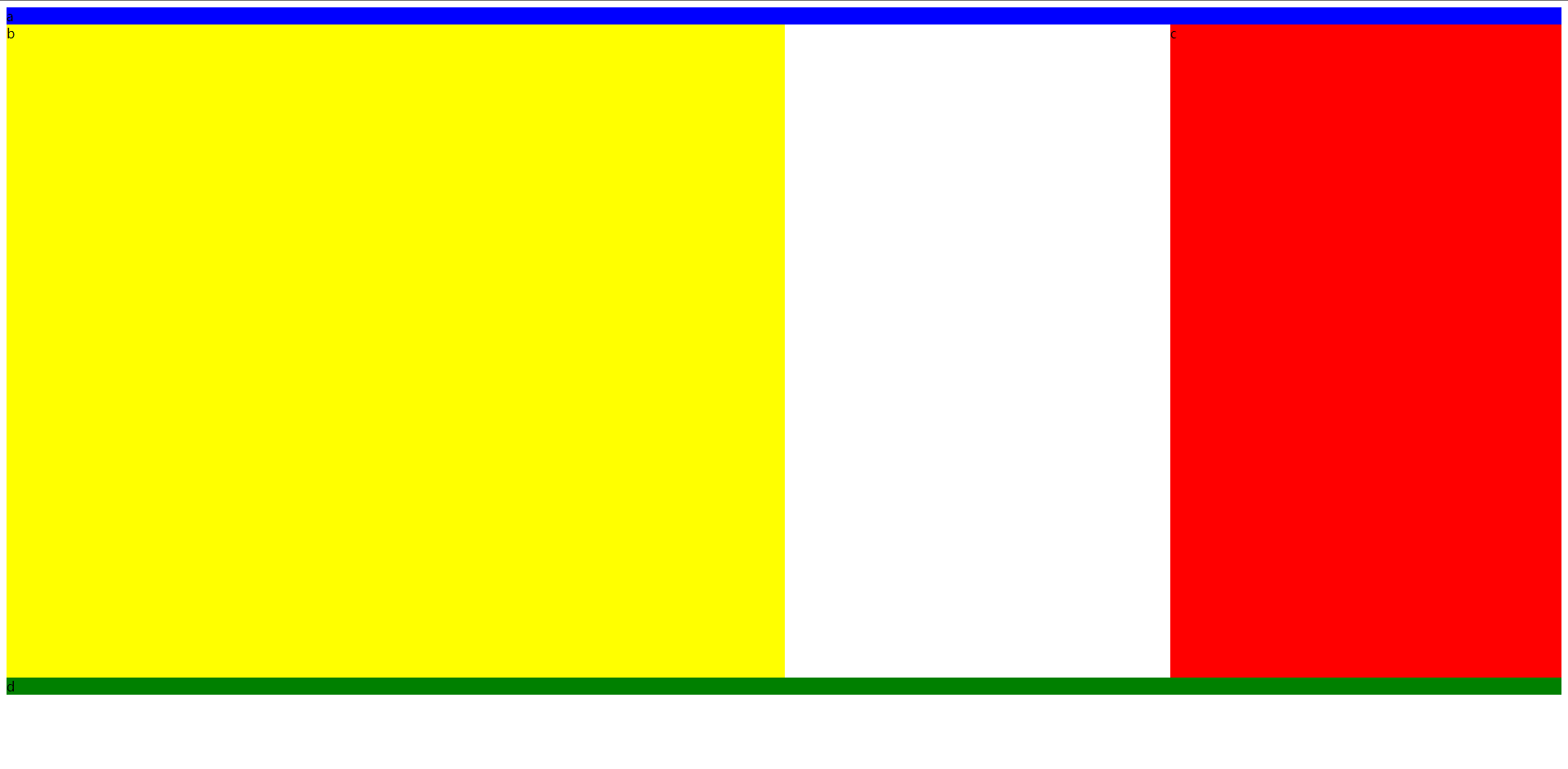 * grid-template:前三个的组合 eg: ~~~css grid-template: [header-start] "header header header header" 100px [header-end] [main-start] "main main . sidebar" 800px [main-end] [footer-start] "footer footer footer footer" 100px [footer-end] / 1fr 1fr 1fr 1fr; ~~~ 有一点很奇怪,就是在grid-template中分列时不能使用repeat,试了老长时间,浏览器都报无法识别属性的错误 * grid-gap:\<grid-row-gap> \<grid-column-gap> 如果属性值只设置了一个值,则 grid-row-gap与 grid-column-gap 被设置为相同的值 * grid-auto-flow: * dense:后面出现较小grid item则尝试填充在网格项中的空缺(不好用) * row:默认值,依次填充每行 * column:依次填充每列 * justify-items/align-items: place-items:\<align-items> \<justify-items>;是它俩的组合 * start:内容与网络区域左端/顶端对齐 * end:与右端/底部对齐 * center:内容位于网格区域的中间/垂直中心位置 * stretch ( default ) :内容宽度/高度占据整个网络区域空间 * place-content: \<align-content> \<justify-content>; * grid-auto-columns: #### 元素属性 未完待续 最后修改:2021 年 11 月 13 日 © 允许规范转载 打赏 赞赏作者 支付宝微信 赞 如果觉得我的文章对你有用,请随意赞赏
